
How to Start a Graphic Design Career : Complete Beginners Guide
Table of Contents
Introduction: Taking Your First Steps into Graphic Design Career
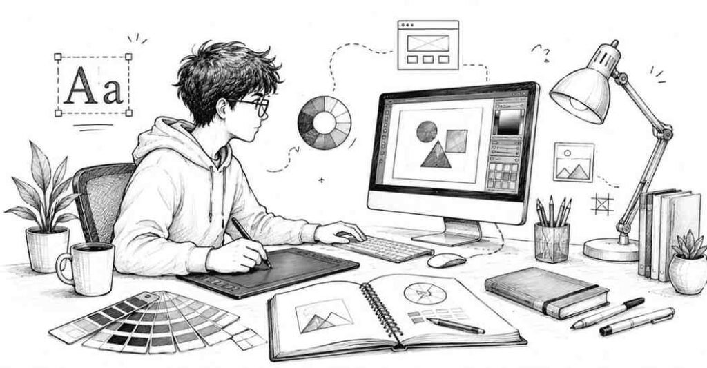
So you’ve decided to explore graphic design. Maybe you’ve always loved drawing and creating visual content, or perhaps you’re tired of your current career and want to try something more creative. Whatever brought you here, you’re probably wondering: “How do I actually start? Where do I begin?”
Here’s the good news graphic design is one of those rare fields where you don’t necessarily need a formal degree to succeed. Many successful designers in India are self-taught, learning through online courses, YouTube tutorials, and countless hours of practice. But the journey does require dedication, patience, and a structured approach to learning.
This comprehensive guide will walk you through everything you need to know as a complete beginner. We’ll cover the fundamental principles every designer must understand, the tools you need to master, free learning resources available to Indian students, your first practice projects, and common mistakes to avoid. By the end of this article, you’ll have a clear roadmap to begin your graphic design journey with confidence.
Let’s start at the very beginning.
Understanding What Graphic Design Really Means
Before diving into software tutorials and design principles, let’s clarify what graphic design actually is.
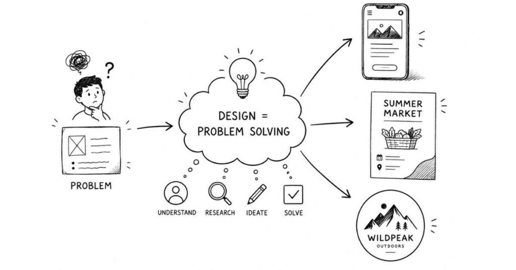
Design is Problem-Solving, Not Just Decoration
Many beginners think graphic design is simply about making things look pretty. While aesthetics matter, graphic design is fundamentally about solving communication problems visually.
Think about the last time you ordered food on Swigato or Zomato. The app’s design—its colors, button placements, icons, and layout—all exist to solve a specific problem: helping you find and order food as quickly and easily as possible. That’s graphic design in action.
When a graphic designer creates a poster for a local movie theatre in Chennai or designs a logo for a new startup in Pune, they’re not just “making it look nice.” They’re communicating specific messages to specific audiences through visual elements.
Design is Everywhere Around You
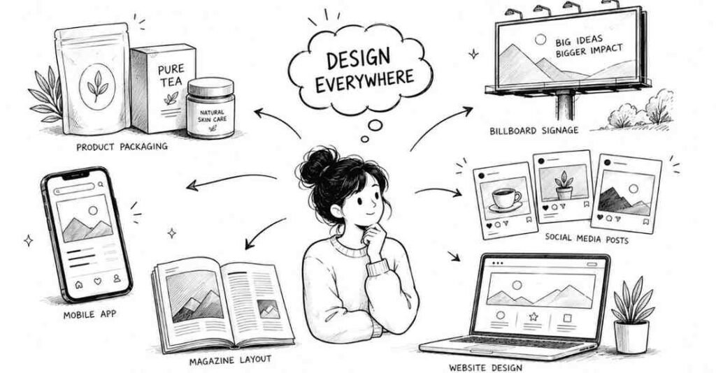
Once you start learning graphic design, you’ll begin noticing it everywhere:
- The packaging of your favorite snacks at the local kirana store
- Hoardings and billboards you pass on your daily commute
- Social media posts from brands you follow on Instagram
- The interface of every app on your phone
- Magazine layouts, book covers, wedding invitations
- YouTube thumbnails, Netflix posters, website layouts
All of these were created by graphic designers who understood visual communication principles. Soon, you’ll start analyzing these designs what works, what doesn’t, and why.
The Core Purpose of Design
Every design should serve at least one of these purposes:
- Inform: Convey information clearly (infographics, reports, signage)
- Persuade: Convince viewers to take action (advertisements, promotional materials)
- Entertain: Engage and delight audiences (social media content, animations)
- Organize: Structure complex information (websites, apps, publications)
Understanding which purpose your design serves helps you make better creative decisions throughout your process.
The 12 Fundamental Principles Every Graphic Designer Must Learn
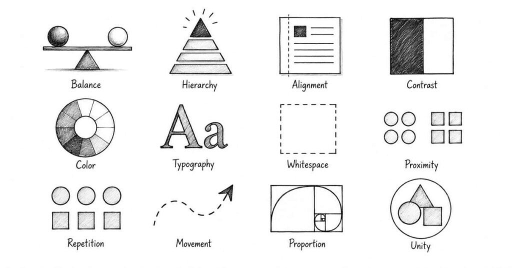
Before touching any design software, you need to understand the foundational principles that make designs effective. These principles apply whether you’re designing a wedding card or a mobile app interface.
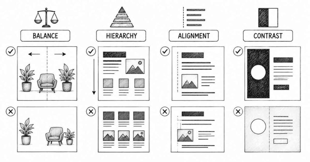
1. Balance
Balance refers to the distribution of visual weight in your design. Just like you wouldn’t pile all the furniture on one side of your room, you shouldn’t cluster all design elements in one corner.
Types of Balance:
- Symmetrical balance: Elements are mirrored equally on both sides (creates formal, stable feeling)
- Asymmetrical balance: Different elements of varying visual weights still feel balanced (more dynamic and interesting)
- Radial balance: Elements radiate from a central point (common in mandalas, logos)
How to Apply: When your design feels “off” or unstable, check the balance. Are all heavy elements (large text, dark colors, complex images) clustered together? Redistribute them for better visual equilibrium.
2. Hierarchy
Hierarchy guides viewers through your design in order of importance. It answers the question: “What should people look at first, second, and third?”
In any poster, notice how the title is largest, the subtitle is medium-sized, and the body text is smallest. That’s hierarchy at work.
How to Apply: Use size, color, contrast, and positioning to create clear dominant, subdominant, and subordinate elements. Your most important message should be the most visually prominent.
3. Alignment
Everything in your design should align to something—whether it’s other elements, an invisible grid, or the edges of your canvas. Random, unaligned elements create visual chaos.
Professional designs use consistent alignment throughout. Notice how text in newspapers aligns to columns, how website buttons align to grids.
How to Apply: Use guides and grids in your design software. Ensure related elements align with each other. Even slight misalignment (by just a few pixels) makes designs look unprofessional.
4. Contrast
Contrast creates visual interest and helps important elements stand out. It can be achieved through differences in color, size, shape, texture, or typography.
Dark text on a light background provides contrast. Large headlines contrasted with small body text create hierarchy. Rounded shapes next to angular ones create visual interest.
How to Apply: If your design feels flat or boring, increase contrast. If it feels too chaotic, reduce contrast in less important areas. Ensure text has sufficient contrast against backgrounds for readability.
5. Color
Color evokes emotions, carries cultural meanings, and helps organize information. Understanding color theory is crucial for effective design.
In India, specific colors carry strong cultural associations—red signifies celebration and marriage, saffron represents courage and sacrifice, white traditionally relates to mourning (though this is changing). Professional designers consider these cultural contexts.
How to Apply: Start with simple color schemes (2-3 colors maximum as a beginner). Use online color palette generators. Ensure adequate contrast between text and backgrounds. Study how established brands use color consistently.
6. Typography
Typography is the art and technique of arranging type. Since text appears in most designs, understanding typography is essential.
Key Typography Concepts:
- Font choice: Different fonts convey different feelings (formal vs. casual, modern vs. traditional)
- Font pairing: Combining complementary fonts (usually no more than 2-3 per design)
- Hierarchy through type: Size, weight, and spacing create reading order
- Legibility: Can people actually read your text easily?
How to Apply: As a beginner, stick to simple, readable fonts like Helvetica, Arial, or Roboto. Avoid decorative fonts until you understand typography better. Never use more than three different fonts in one design.
7. White Space (Negative Space)
White space is the empty space around and between elements. Beginners often try to fill every bit of space, creating cluttered designs.
Professional designs use generous white space. Notice how luxury brands use lots of empty space—it creates a sense of sophistication and focuses attention
How to Apply: Don’t be afraid of empty space. It makes your design breathe and draws attention to important elements. When in doubt, use more white space, not less.
8. Proximity
Elements that are related should be grouped together; unrelated elements should be separated. This helps viewers understand relationships between different parts of your design.
On a restaurant menu, items in the same category (appetizers, main courses, desserts) are grouped together using proximity.
How to Apply: Group related text and images close together. Use white space to separate different sections. This creates visual organization without needing boxes or lines around everything.
9. Repetition
Repeating visual elements (colors, fonts, shapes, styles) creates consistency and unity. Think of brand guidelines—companies repeat the same colors, fonts, and styles across all materials.
How to Apply: Once you choose design elements (specific blue shade, particular font, certain icon style), repeat them consistently throughout your design and across different materials.
10. Movement
Movement is how viewers’ eyes travel through your design. You can guide this journey using placement, direction, and visual cues.
Common eye-tracking patterns include the Z-pattern (used in many web layouts) and the F-pattern (how people scan text-heavy pages).
How to Apply: Place your most important information where viewers naturally look first. Use directional elements (arrows, lines, gazes) to guide attention to key areas.
11. Proportion
Proportion refers to the relative size and scale of different elements. Elements should be sized according to their importance and relationship to other elements.
A headline that’s only slightly larger than body text doesn’t create clear hierarchy. A logo that’s too large dominates everything else inappropriately.
How to Apply: Create clear size differences between different hierarchy levels. Test your proportions by viewing your design from a distance—does the hierarchy still work?
12. Unity
Unity means all elements work together to create a cohesive whole. Despite variety in your design, everything should feel like it belongs together.
How to Apply: Maintain consistent style, color scheme, and typography throughout. Every element should serve the overall message and aesthetic.
Your First Graphic Design Tools: Starting Simple
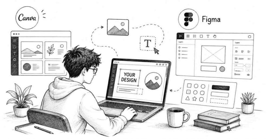
One of the biggest mistakes beginners make is thinking they need expensive software immediately. You don’t. Start simple and progress gradually.
Free Tools for Complete Beginners
Canva (Free Version)
Canva is perfect for absolute beginners. It offers:
- Drag-and-drop interface (no design experience needed)
- Thousands of templates for social media posts, presentations, posters
- Free stock photos, icons, and fonts
- Preset dimensions for Instagram posts, Facebook covers, etc.
Why Start Here: Canva lets you focus on learning design principles without struggling with complex software. You can create actual projects while learning what makes designs work.
Limitations: Canva creates raster images (pixels) rather than vector graphics, so designs don’t scale well to very large sizes. It’s great for digital content and small prints but limited for professional logo design or large-format printing.
Best For: Social media graphics, presentations, posters, invitations, simple infographics.
Figma (Free Version)
Figma is a professional interface design tool used by UX/UI designers worldwide. The free version is surprisingly powerful.
Why Consider It: If you’re interested in web or app design, starting with Figma teaches you industry-standard tools from day one. It’s also completely free for individual use.
Learning Curve: Steeper than Canva, but there are excellent YouTube tutorials available.
Best For: Website mockups, app interface design, UI elements, digital product design.
Free Learning Resources for Indian Students
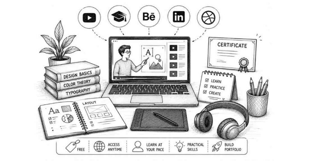
One of the best things about learning graphic design in 2026 is the abundance of high-quality free educational content.
YouTube Channels (Free Forever)
YouTube offers some of the best graphic design education available:
- The Futur: Professional design advice, client management, business skills
- Satori Graphics: Design principles, logo design, creative processes
- Will Paterson: Logo design, branding, design critiques
- Envato Tuts+: Comprehensive design tutorials covering all aspects
- Flux: Creative inspiration and design techniques
- Skillthrive: Practical design projects and career advice
Strategy: Don’t just watch randomly. Follow a channel’s beginner series from start to finish before jumping around.
Coursera (Audit Courses for Free)
Coursera offers courses from top universities worldwide. You can audit most courses for free (you won’t get certificates, but you access all content).
Recommended Starting Course:
“Fundamentals of Graphic Design” by California Institute of the Arts
This 4-week course covers:
- Image making and typography
- Shape, color, and composition
- Visual contrast and designing with text
- Real-world design projects
Over 880,000 students have enrolled, with excellent reviews.
How to Access: Create a free Coursera account, search for the course, and select “Audit” instead of paying. You’ll get full access to all video lectures and assignments.
Canva Design School (Free)
Canva offers free design courses specifically for beginners using their platform:
- 12 lessons covering design fundamentals
- Approximately 44 minutes of content
- Practical, hands-on learning
- Covers typography, color theory, alignment, visual hierarchy
Best Part: You can immediately apply what you learn since you’re learning on the same platform.
Free Resources from Indian Institutions
Several Indian platforms offer free graphic design resources:
- Great Learning: Free introductory courses in Photoshop and video editing
- Shiksha Online: Curates free graphic design courses from multiple platforms
YouTube channels by Indian designers: Many Indian designers create content specifically addressing Indian market needs and preferences
When to Invest in Paid Software
Don’t rush into Adobe Creative Cloud subscriptions immediately. But once you’re serious about pursuing design professionally (usually after 2-3 months of consistent learning), consider investing in proper tools.
Adobe Creative Cloud (Student Discount Available)
Adobe offers significant student discounts in India (approximately 60% off). The complete Creative Cloud subscription includes:
- Photoshop (photo editing, digital design)
- Illustrator (vector graphics, logos, illustrations)
- InDesign (multi-page layouts, publications)
- After Effects (motion graphics, animation)
- Adobe XD (UI/UX design, prototyping)
- And 15+ other apps
Current Student Pricing in India: Around ₹1,600-2,000 per month with student discount (check Adobe India website for current rates).
Individual App Subscriptions: If you can’t afford the full suite, subscribe to single apps (typically ₹1,600-2,200 per month per app in India).
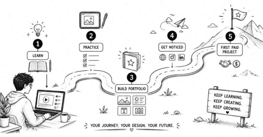
Your First Five Practice Projects
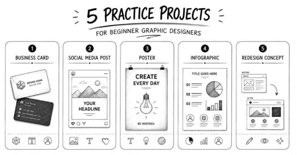
Theory only gets you so far. You need to actually create designs to improve. Here are five beginner-friendly projects that teach fundamental skills.
Project 1: Design Your Own Business Card
What You’ll Learn: Layout, typography, alignment, working with small dimensions
Specifications: Standard business card is 3.5 x 2 inches (89 x 51 mm)
Requirements:
- Include name, title/profession, phone number, email
- Choose two complementary fonts (one for name, one for details)
- Use one or two colors maximum
- Keep it simple—resist the urge to add too much
Challenge: Design both horizontal and vertical versions. Which works better?
Tools: Start in Canva, then try recreating it in Illustrator if you have access.
Project 2: Create a Social Media Post Series
What You’ll Learn: Consistency, repetition, working with digital dimensions, brand identity basics
Assignment: Create a 3-post Instagram series on a topic you care about (fitness tips, book recommendations, cooking recipes, design principles).
Requirements:
- All three posts should use the same color scheme and fonts
- Include both text and images/illustrations
- Maintain consistent style across all three
- Use Instagram’s recommended dimensions (1080 x 1080 px for square posts)
Why This Matters: Brands need consistent social media content daily. This is one of the most in-demand skills for entry-level designers.
Project 3: Design a Simple Poster
What You’ll Learn: Hierarchy, composition, working with larger formats
Assignment: Create a poster for a fictional event (music concert, food festival, workshop, movie screening).
Requirements:
- Include event name (most prominent), date/time, location, brief description
- Use clear hierarchy (viewers should know what’s most important at a glance)
- Include at least one visual element (image, illustration, or graphic)
- Size: A3 (297 x 420 mm) or 11 x 17 inches
Pro Tip: Print your design (even on regular printer paper) to see how it looks physically. Digital and print can look quite different.
Project 4: Create an Infographic
What You’ll Learn: Organizing information, data visualization, combining text and graphics
Assignment: Turn information about something you know well into a visual infographic (how your city’s metro system works, nutrition facts of popular Indian foods, timeline of Bollywood movies, steps to make chai).
Requirements:
- Present 5-7 data points or steps
- Use icons or simple illustrations
- Apply clear hierarchy
- Make it vertically scrolling (good for social media sharing)
Tools: Canva has excellent infographic templates, or use Piktochart (specifically designed for infographics).
Project 5: Redesign Something You Use Daily
What You’ll Learn: Critical thinking, problem-solving, understanding user needs
Assignment: Find a design you encounter daily that you think could be better (app icon, product packaging, website homepage, restaurant menu) and redesign it.
Process:
- Identify what doesn’t work in the original
- Sketch 2-3 different solutions
- Create your redesigned version digitally
- Explain your design decisions
Why This Matters: This is how designers think. You’re not just making things pretty—you’re solving problems.
Common Beginner Mistakes to Avoid
Learning what NOT to do is just as important as learning what TO do. Here are mistakes nearly every beginner makes.
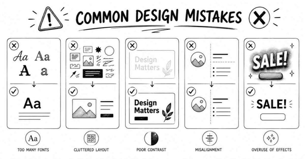
1. Using Too Many Fonts
The Mistake: Using 5-6 different fonts in one design because you think it adds variety
Why It’s Wrong: Multiple fonts create visual chaos and look unprofessional.
The Fix: Limit yourself to 2-3 fonts maximum per design. One for headlines, one for body text, and occasionally one for accent text.
2. Ignoring White Space
The Mistake: Filling every bit of space with text, images, or design elements because empty space feels “wasteful”.
Why It’s Wrong: Cluttered designs overwhelm viewers and make nothing stand out.
The Fix: Embrace white space. It makes your design breathe and draws attention to important elements. When in doubt, use more space, not less.
3. Poor Color Contrast
The Mistake: Light gray text on white backgrounds, or colors that are too similar.
Why It’s Wrong: Viewers can’t read your text, defeating the entire purpose of your design.
The Fix: Always test readability. Can you read the text from 10 feet away? Does it work for people with vision impairments? Use high-contrast combinations for text.
4. Overusing Effects
The Mistake: Adding drop shadows, gradients, bevels, glows, and outlines to everything.
Why It’s Wrong: Effects should enhance your design subtly, not dominate it. Overuse looks amateurish and dated.
The Fix: Use effects sparingly and intentionally. Ask yourself: “Does this effect serve a purpose, or am I just adding it because I can?”
5. Not Using Grids and Alignment
The Mistake: Eyeballing alignment and positioning elements randomly.
Why It’s Wrong: Even slight misalignments (by a few pixels) make designs look unprofessional and careless.
The Fix: Always use grids, guides, and alignment tools in your design software. Enable “snap to grid” features. Check that elements align perfectly.
6. Ignoring the Design Brief
The Mistake: Creating designs based on what YOU like rather than what the project requires.
Why It’s Wrong: Design is about solving specific problems for specific audiences, not showcasing your personal taste.
The Fix: Always start by understanding the requirements:
- Who is the target audience?
- What message needs to be communicated?
- Where will this design be used?
- Are there any brand guidelines to follow?
7. Using Low-Quality Images
The Mistake: Using pixelated, blurry, or low-resolution images because they’re free or easy to find.
Why It’s Wrong: Low-quality images make your entire design look unprofessional, no matter how good everything else is.
The Fix: Use high-resolution stock photos from quality free sources (Unsplash, Pexels, Pixabay) or create your own graphics. Learn the difference between image resolution for web (72 DPI) vs. print (300 DPI).
8. Not Saving Properly
The Mistake: Not understanding file formats, working only in JPG, or not keeping original editable files.
Why It’s Wrong: You can’t edit your designs later, you lose quality with every save, and you can’t provide proper files to clients or printers.
The Fix: Learn file formats:
- Work files: Keep original PSD (Photoshop), AI (Illustrator), or Canva files
- Web use: Export as JPG (photos) or PNG (graphics with transparency)
- Print use: Export as PDF or high-res JPG at 300 DPI
Logos: Always save vector files (AI, EPS, SVG) that scale infinitely
Creating Your Learning Schedule
Consistency beats intensity in creative skill-building. Here’s a realistic learning schedule for beginners.
First Month: Foundations
Week 1-2:
- Complete one comprehensive beginner course (Coursera Fundamentals course or Canva Design School)
- Watch 2-3 YouTube tutorials daily (30-45 minutes)
- Practice what you learn immediately
- Study designs you encounter daily—what makes them work?
Week 3-4:
- Complete your first three practice projects
- Start following design accounts on Instagram and Behance
- Join one online design community (Reddit r/graphic_design, Facebook groups)
- Begin collecting inspiration (create a Pinterest board or save examples)
Second Month: Building Skills
Week 5-6:
- Start learning one Adobe program in depth (Illustrator for logos/vectors, or Photoshop for digital/photo work)
- Follow structured tutorials (not random videos—complete series)
- Create 2-3 new projects weekly
- Attempt redesigning existing designs you find
Week 7-8:
- Complete two more complex projects (multi-page brochure, website mockup, packaging design)
- Start documenting your process (screenshots, notes on decisions)
- Get feedback from online communities
Begin building a simple portfolio (Behance account with your best 5 pieces)
Third Month: Specializing and Applying
Week 9-10:
- Choose a specialization you enjoy most (logos, social media design, UI/UX, illustration)
- Focus learning on that specialization
- Create 3-5 projects in your chosen area
- Study successful designers in that niche
Week 11-12:
- Apply for your first freelance projects (Fiverr, local businesses)
- Or apply for internships if you prefer structured learning
- Create a more polished portfolio (10-12 pieces)
Start sharing your work on social media with relevant hashtags
Daily Practice Habits
30-Minute Daily Practice:
- 10 minutes: Study one excellent design (analyze what works and why)
- 15 minutes: Create something (even if it’s just practicing typography or color palettes)
- 5 minutes: Engage with the design community (comment on others’ work, ask questions)
Why Daily Matters: Creating designs activates different thinking than just watching tutorials. Even 30 focused minutes daily beats 4 hours once a week.
Your Next Steps: Moving Forward
You now have a solid foundation to begin your graphic design journey. But knowledge without action means nothing in Graphic Designer Journey.
This Week's Action Items
- Choose your starting tool: Download Canva (easiest) or Figma (if you’re interested in UI/UX)
- Enroll in one free course: Start the Coursera Fundamentals course or Canva Design
- Complete the first lesson: Don’t just watch—do the exercises
- Create something: Even if it’s simple, make one design today
Join a community: Search for “graphic design India” groups on Facebook or join Reddit’s r/graphic_design
This Month's Goals
- Complete a beginner course fully: Don’t jump between multiple courses; finish one completely
- Create 10 practice designs: Focus on variety (business cards, social posts, posters)
- Study 50 designs: Analyze what makes them effective
Share your work: Post at least 5 designs on Behance or Instagram (even if they’re not perfect)
Within Three Months
- Build a portfolio: Showcase 10-15 of your best projects
- Learn one Adobe program: Become comfortable with either Photoshop or Illustrator
- Complete your first paid project: Even if it’s just ₹500, getting paid validates your skills
Connect with other designers: Attend a local design meetup or join online communities actively
Final Thoughts: Your Creative Journey Begins Now
Starting anything new feels overwhelming. Graphic design has so many tools, principles, techniques, and specializations that it’s easy to feel lost before you even begin.
But here’s what you need to remember: every professional designer you admire was once exactly where you are now a complete beginner wondering if they could actually do this.
The difference between them and people who gave up? They started. They created terrible designs initially (all beginners do). They kept practicing. They learned from mistakes. They gradually improved. They stayed consistent.
You don’t need expensive equipment, formal degrees, or natural talent to start. You need curiosity, willingness to learn, and commitment to practice regularly.
Start today. Create something anything even if it’s just experimenting with fonts or colors in Canva. Post it somewhere. Get feedback. Create again tomorrow.
Three months from now, you’ll look back at your first designs and cringe a little. That’s perfect. It means you’ve grown. Six months from now, you’ll have a portfolio. A year from now, you might be freelancing or working as a junior designer.
But all of that starts with your first design. What will you create today?